Visual Merchandising
Visual Merchandising
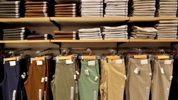
Presentation by Color (Section 3, Part 2)
This course addresses the importance of color when marketing and merchandising products in the retail store. These parts expand the use of visual merchandising in today’s modern retail store in order to increase sales volume, profit margin, and market share.
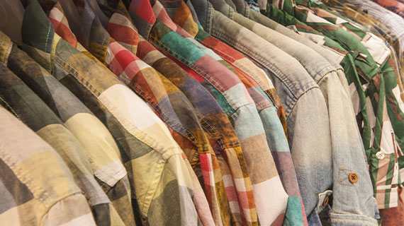
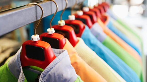
Color is the single most important element in both merchandise presentation and display. In fact, color is the first element in any visual presentation that attracts attention. Color may create or become 80 % of the merchandise/display presentation. However, color is a personal, individual, private experience that is influenced by culture, regional and global locations, and environmental background. For example, in the United States, the traditional attire of the bride is a white wedding dress, while in other countries red is the color of choice. For funerals, black is the color frequently worn to symbolize sadness and death in western countries; but white is the color of death in China, and purple is the color that designates death in Brazil.
15-Point Checklist for Displays
(Section 4, Part 2-1)
Does the merchandise or display:
- Attract attention
- Build store and fashion image
- Assist customers in self-selection
- Present the “total look” depicting the target consumer’s lifestyle
- Inform the customer of the latest fashion trends
- Sell merchandise
10 Common Sense Rules for Displaying
(Section 4, Part 2-2)
- Never display one remaining piece of an item (unless it is a one-of-a-kind, very exclusive, or represents the entire classification).
- Never mix sizes of coordinates or layered items.
- Always display the smaller size of a garment when available.
- Always position the display near the featured merchandise.
- Always accessorize in order to present the total look. Remember, sometimes less is more.
- Remember, merchandise comes first, but close behind is the idea (theme).
- Always pay close attention to the small details such as housekeeping, visible tickets, wrinkles, etc.
- Carefully choose an attention-getting device.
- Select merchandise that is new and newsworthy.
- Always select display techniques that enhance the merchandise and present a consistent store and fashion image to the target consumer.
Summary
(Section 4, Part 3)
- Establishing the Retail Environment & Store Image: Visual Merchandising & Display
- Six Basic Principles of a Retail Merchandise Presentation or Display
Examine Six Basic Principles of Display (Section 4, Part 1)
Visual merchandising, especially display, is one of the most creative, exciting, exhilarating, and fun responsibilities of the Sales Promotion Division. Yet, at times it can be very frustrating, most difficult, and laborious work. Like other careers in the marketing field, the visual merchandiser’s job is never done and sometimes the time spent on the work is not evident to the target consumer. However, it is very rewarding for the visual merchandiser to see all of the products in a display sell out completely or to observe the consumer enjoying the presentation.
Plan the Merchandise Presentation & Displays
Visual merchandising personnel must develop a plan for each merchandise presentation. Initially, an overall strategy that defines the Who, Why, What, Where, and When of a merchandise presentation must be established. Additionally, there must be a timetable, organizational chart, and sketch to scale for each major display event.
Select Merchandise Thoughtfully
When building the actual display, the first step the visual merchandiser takes is that of analyzing and selecting the merchandise to be displayed. It is of utmost importance that display personnel recognize that the merchandise to be displayed is the focus of the artistic endeavor and that all other elements needed to build the display play a supporting role to the merchandise itself.
Select Color & Texture First, Then Define Line
Although reaction to color is a personal, individual, private experience that is influenced by culture, regional and global locations, and environmental background, the consumer is instinctively impacted by colors with which they are confronted every day in their environment. For example, blue reminds the adult consumer of the ocean or water and the sky. It is a universal color that is calming and restful. In fact, it is a color that is selected by both men and women as a favorite.
Maintain Good Composition
The fourth principle is Maintain Good Composition.
When creating the design of each display, the composition or the use of the art elements (i.e., color, texture, proportion, line, and shape) and design principles (i.e., composition, balance, rhythm, repetition, and dominance) along with the theme, props, attention-getting devices, and signage must be planned in detail. The impact of the design principles, attention-getting devices, and signage are explained in this part.
Plan Lighting Techniques
Light is composed of waves of radiant energy that are either reflected or absorbed. When light is absorbed, the color of an article or item is seen. In other words, there must be light for color to be seen.
The primary light colors are red, green, and blue. (Note that the yellow pigment is not a primary light color!) As with mixing primary pigments to create other colors, the primary light colors can be mixed to form the secondary light colors of magenta (i.e., purplish-red), amber (i.e., brownish gold-like yellow), and cyan (i.e., blue-green). These colors can provide interesting effects on both positive elements and negative spaces.
Evaluate Effectiveness of Presentations
Maintaining good composition in an artistic endeavor is critical to creating unity and harmony in the display. In order to communicate a well-planned message and direct the consumer’s eye to all the elements of the display, the visual merchandiser must carefully plan the type of balance and the dominant item or focal point of the display, along with the mechanisms for creating rhythm.
- Does the type of balance support the theme and merchandise classifications in the display?
- Is the focal point evident?
- Are there items, such as props and attention-getting devices, which direct the viewer’s eye from the dominant area to all other areas of the presentation?
- Are there odd numbers of items utilized to create interest and provide rhythm in the composition?
- Are all components in proportion to the whole as well as to each other component in the display?
A creative endeavor can be planned and assembled perfectly. However, if the proportions of the components are not compatible, the viewer senses the instability of the composition.
Planning the Retail Merchandise Presentation
Visual merchandisers utilize the same tools, art elements, and design principles in order to establish the store ambience or atmosphere and environment, merchandise the store and/or department, and create displays. The art elements include color, texture, proportion, line, and shape, while the design principles include composition, balance, repetition, rhythm, and dominance.
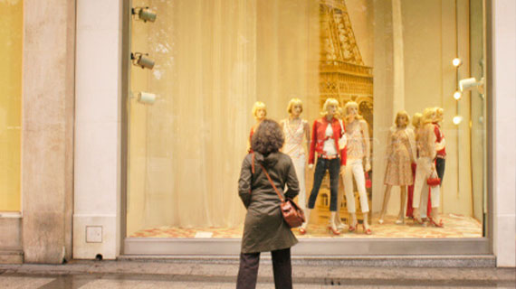
Windows-on-the-Aisle
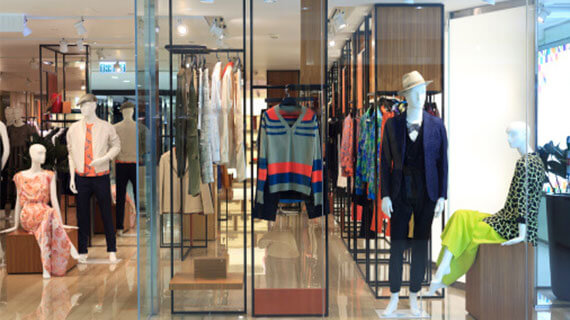
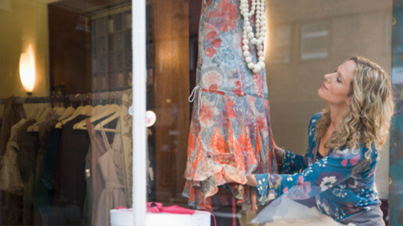
The first one-third of the department is the primary selling area of the store. As the entrance to the store must be exciting and inviting to the target consumer, the window area of the storefront, if applicable, or the aisle area of the department must make a statement or entice the customer to come into the department. This area is denoted as windows-on-the-aisle to correspond to previous times in retail when stores on main streets in all cities across the U.S. had beautiful window displays. These illustrative works of art or theatrical and dramatic displays were created in order to attract the attention of the target consumer and to acquaint the customer with the merchandise mix, brands, and product classifications available in the store!
Bread-and-Butter or Core
The second area in the 3 x 3 Merchandise Presentation is the Bread-and-Butter or core of the store or department. The Bread-and-Butter is the center of the department that houses the volume merchandise. More specifically, this is usually the location where the classic, basic, and/or volume merchandise assortments, coordinated groupings, promotional merchandise, and sometimes sale or reduced merchandise are presented and displayed.
Top or Vista Walls
These walls are the second most important selling area in the store or department. Here again, color is the number one element to address and line selection follows closely behind or is second for merchandising and displaying product. Balance and proportion are the next essential elements to consider when planning the merchandise presentation in a large expanse of wall space.
Consistent Merchandising Policy
Another step in establishing the retail store image consists of establishing a consistent merchandising policy. In the previous part of this section, establishing the fashion image and selecting fashion merchandise was addressed.
Other aspects of building the merchandising policy include:
- Establishing the procurement procedures and policies, including the retail/vendor matrix, buying procedures, and merchandise mix
- Instituting markup and markdown policies
- Establishing pricing procedures
- Coordinating the sales promotional activities
- Advertising
- Sales promotions and events
- Visual merchandising
- Merchandise
- Displays
- Fashion coordination
- Publicity/PR
Planning a Merchandise Presentation
Planning an exciting merchandise presentation is one of the most important steps in establishing the store and fashion image. Arranging the merchandise in the store with relation to floor and wall space must be carefully planned in order to produce maximum sales dollars per square foot.
Today’s consumers demand:
- Convenient, easy-to-traverse traffic patterns in the store
- Merchandise that is positioned in easy-to-find locations and easy to shop
- Displays that excite and depict the lifestyle of the shopper
- Exciting “retailtainment” environment in the store
Developing the Fashion Image
Fashion touches all types and varieties of product classifications from apparel, accessories, and footwear to home décor, furniture, kitchen utensils, and home appliances, to cars, boats, and motorcycles. There are very few products in the marketplace that are not in some manner impacted by fashion design and/or the fashion cycle. Fashion permeates all aspects of our environment.
Therefore, the retailer must assure that a constant and consistent fashion image is established and maintained by his retail business in order to establish the store’s identity and fashion leadership in the community. From the signage and exterior of the store to its entrance and window displays, the fashion image becomes evident to the consumer through the exterior and interior décor and visual merchandise presentation, especially the displays with the types of props and attention-getting devices utilized to attract the target consumer.
Develop the Store Image
The third step in developing the store image is selecting the elements or store image cues and attributes that create the mental image or impression the public perceives regarding the store’s personality. Each retailer must “paint a picture” or present a unique personality or character of the store that he wishes the target consumer to recognize in comparison to the store’s competition. Store image is a mirror of what the store stands for with regard to value/quality of merchandise, price of product assortments, customer service types, store personnel, promotional direction, and community citizenship.
General Elements for Building Store Image
As has been previously discussed, the history and origin of the store many times flavors the opinion a consumer has of a specific retailer.
Knowing the founders or family of the founders of a retail firm or realizing that a store is well established gives credibility to a retail business. Customers like to shop in a store that has a track record of success and is well respected in the community.
Physical Elements for Building Store Image
The consumer’s first introduction to a retail store is the center’s marquee and/or the retailer’s signage. The signage is oftentimes on the marquee and also on the storefront. The signage should automatically identify the personality of the store and provide information about products, services, and the interior store environment. Signage sets the mood and is the first indicator or cue to assist in establishing an image for the retailer. The lettering of the signage is most important. The letter type, style, color, and materials from which the sign is made are all significant elements that help to tell a story.
Personnel Elements for Building Store Image
Many consumers equate a store with the quality and number of its personnel or employees.
In fact, some consumers shop with a particular retailer because of the availability of trained employees who provide superb customer assistance, the product knowledge possessed by the store employees, or the friendliness of the store personnel.
Customer Service Elements for Building Store Image
The consumer’s perception of the store’s customer services and the responsiveness of the store to the customer are both very important in establishing a constant and consistent store image.
Easily accessible web pages, 1-800 numbers, e-mail messages answered in a timely manner—even informational catalogs—are almost a must in today’s retail scene. For customer convenience and time-saving measures, many consumers have come to expect that retailers offer these services.
Product Elements for Building Store Image
The right product in the right styles, colors, and sizes—at the right price, in the right quantities—merchandised in the right place, at the right time are major factors impacting store image.
The “Retail/Vendor Matrix”, or a listing of the retailer’s major vendors supplying the store’s merchandise, assists the retailer in denoting the fashion level of the merchandise carried by the store as well as suggests price points of the merchandise.
Price Elements for Building Store Image
The retail prices of the merchandise carried by a retail store are not only an indication of the channel of distribution and location in which the store operates but also these prices impact the types of product classifications offered and the fashion level of the product. The price ranges, or price lines with lowest to highest retail prices, of a store’s merchandise assortments, also function as store image cues that target consumers consider when selecting a specific retail store for purchases. Additionally, the price points, or specific, selected prices within the price range for a particular product classification, signify store image cues.
Placement Elements for Building Store Image
As previously discussed in this section, Part 2: “Investigate the Trading Area”, the placement attribute is one of the most critical image cues for establishing the store image and determining the merchandise presentation and display techniques utilized by the visual merchandiser.
As management develops the strategic plan and establishes the cues for store image, the organization pinpoints the target consumer, store location, and product offering plus the channel of distribution in which the store operates.
All of these elements are intricately related and one affects all of the others
Integrated Promotional Mix for Building Store Image
The composition of the marketing mix (i.e., 10 Ps or product, price, place, promotion, presentation, people, positioning, packaging, processing, playback) and sales promotional mix (i.e., advertising, visual merchandising, special events and promotions, publicity, fashion coordination, and training) definitely impact and foster the building of a sound store image. The promotional mix is usually manipulated not only to attract customer traffic and promote additional sales volume but also it is planned to build and maintain store image and solidify the positioning of the store.
Store Location
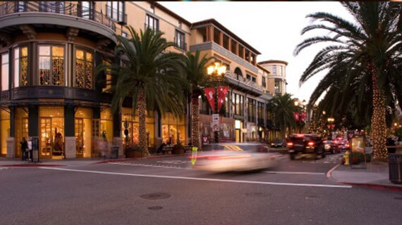
Store location is an essential element of the store’s brand image and impacts other image elements such as the store’s external environment, including landscaping and parking areas; the store’s architecture, both exterior and interior décor; and the store’s promotional mix, especially the visual merchandise presentation and display techniques. Additionally, store location is a critical consideration when the retailer identifies its target consumer segment and establishes its merchandising policies and marketing mix.
Pedestrian & Vehicular Traffic
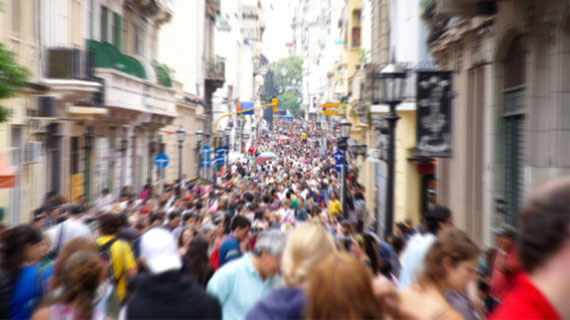
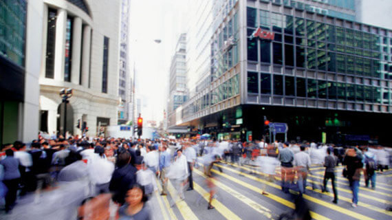
If a store has pinpointed its target consumer, it is most important that the store location is compatible with geographical areas where that consumer shops. The number of consumers and the specific target segments shopping in the location are critical to a successful retail operation. When assessing the pedestrian or foot traffic at a specific retail location, the consumer’s age, gender, occupation and income level, as well as intention to buy, are criteria that must be analyzed. Also, the day of the week and the time of the day that these consumers visit the shopping area should be investigated.
Transportation & Parking Facilities
Retail stores frequented mainly by vehicular traffic should be in geographic locations where there are major highways or arteries easily accessible, where traffic patterns or roads are safe to travel, and where adequate mass transit such as buses, taxis, bike paths, or other modes of transportation exists. For example, if a shopper must make a left turn without a traffic light in a busy intersection, that consumer may avoid that particular shopping location.
Tenant Mix
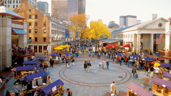
The tenant mix of a shopping center or the number and types of retailers located within a specific center must be a “fit” with the location and target consumer. Since many consumers come to a mall or shopping center for one-stop shopping, they desire stores that are compatible, complementary, and provide a variety of goods for comparison shopping as well as an adequate availability of various product classifications.
Specific Site Visibility & Surrounding Environment
The site visibility or possibility that the consumer may immediately see the storefront and/or signage of a specific store from the access road and/or the parking lot is very important in building store traffic. The consumer’s initial introduction to a store establishes first impressions. Sometimes those impressions are most difficult to change in the mind of the consumer. Also, the first visible image characteristics that the consumer sees or the appearance of the storefront and signage are cues that will entice the consumer to enter or not enter the store.
Placement of Store within Specific Site
The placement or location of the store within the shopping center or mall is also an important consideration for the retailer. Further, the placement impacts the job responsibilities of the visual merchandiser. An ideal location for a retailer is a corner space since there are at least two access venues for the consumer. Also, there is usually more window display space since the store is visible from two sides of the building. Therefore, more pedestrian traffic and vehicular traffic should be anticipated for the corner store.
Terms of Occupancy
Retailers or store groups with multiple stores usually lease buildings for their retail stores instead of owning real estate. Small stores or regional groups may build their own buildings to specifications and control all aspects of the physical building. There are pros and cons for both types of occupancy, depending on the geographical region of the country, the store type and number of stores, and the liquidity of the assets of the retailer.
Promotional Activities
As previously discussed, most large shopping centers or mall complexes maintain a marketing department that promotes the mall itself or an event within the mall. At other times, the marketing department may feature happenings, promotions, and special events for select stores in the mall. For example, these marketing endeavors may include television advertisements announcing a seasonal holiday event such as the Easter Bunny being available for pictures with the children at the mall or Santa arriving at the mall.
Economic Bases
Within a trading area, the economic base is an indicator of the target consumer’s income. Therefore, economic statistics such as unemployment rate, interest rates, types and numbers of industry available for employment, educational level of consumers, and median household income as well as buying income, building permits, and tax rates are tracked continually by the retailer. These factors determine the amount of discretionary income available for the purchase of products other than those needed for necessity items.
Housing Patterns
The average value of a house in a geographic area, the types of housing available, and the locations of those houses are very important factors for retailers to consider when selecting a store location. Do the nearby residential areas have more single-family dwellings or more apartments, condos, or townhouses? What are the interest rates on home mortgages? What are the county and city tax rates? And, what are the income levels of residents in the area?
Visual Merchandising
Defining Visual Merchandise and Display provides background information and basic terminology needed to build a workable understanding of visual merchandising and the vocabulary needed to understand and differentiate between the various types of merchandising.
We recommend printing off the content reference guide to assist you.
Defining Visual Merchandising & Display Concepts
Visual merchandising is now a major factor impacting the store and brand image, the retail store environment, and the merchandising and marketing of the store. No longer is visual merchandising considered as an extra function that may or may not be important for the success of the retailer. It is now considered an integral part of the business operations for sustaining a vital retail business.
Terminology for Visual Merchandising & Display
Display Settings: background or type of setting for presenting merchandise or display
- Abstract Setting: background setting does not look like a realistic area or concept; the eye cannot decipher a concept but the setting supports and reinforces the message and merchandise in the display (e.g., arrangement of lines and shapes in various spaces of the setting to provide a backdrop for merchandise)
- Environmental Setting: all of the items in the display are for sale or background becomes merchandise to sell (e.g., a bedroom display with furniture, home furnishings and textiles, and accessories for a bedroom)
- Fantasy Setting: a setting created with expected or unexpected elements in unexpected places; a whimsical setting or an imaginative or fictitious setting for ordinary merchandise categories (e.g., chair and table on the ceiling of display area)
- Realistic Setting: an everyday life environment or recognizable area interpreted in the display (e.g., a couple sitting at a table in the restaurant) – display could feature apparel or fine china, crystal, and silver on the table or all of the product classifications
- Semirealistic Setting: vignette setting or setting with recognizable product in a recognizable space but the viewer must use imagination to complete the design idea
